It’s funny how color has such a strong impact on the mood of a painting.
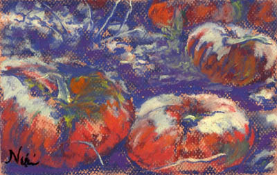
“Bitter Harvest” 6 x 9 Pastel on paper
Fall is normally a happy time for me: the weather is cooler and the local scenery comes to life with blazing complementary colors. I’m not sure why I used the color scheme I did for this piece–it may have had something to do with the fact that these were abandoned pumpkins, and they looked a little rotten on close examination. I ended up using cool lights and warm shadows, which made the outcome a little garish. I enjoyed the contrast as I painted though.
I have wonderful pictures of our local pumpkin patch, and have created a few paintings with happier color schemes. I used two of them for some online art lessons this month:
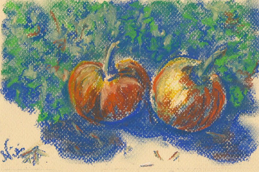
“Pumpkin Pair” 6 x 9 Pastel on paper
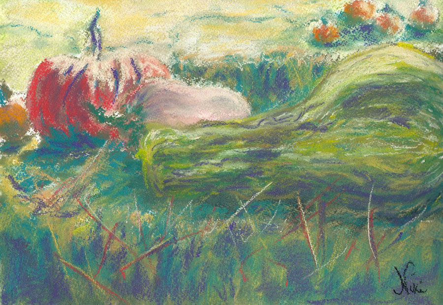
“Harvest Time” 9 x 12 Pastel on Paper
To me, fall is beautiful because of all the naturally complementary colors: deep blue skies, warm orange pumpkins, red and green leaves on the trees, dry golden fields with purple shadows…both as an artist and a native Californian, I think the best time to be out looking for things to paint in Southern California is during the fall season.
If you’d like to teach (or try) some fall-themed paintings, check out my lessons on Bright Hub: